Friday, May 08, 2009
The hidden tax, visualized
Taxes on income are obvious, as are many (though not all) taxes on the spending of money and consumption. Value-added taxes would be difficult to see, but you have to document them to collect them and that's when we see them, too. So governments are quite good at grabbing a vig when money moves. But that leaves a vast pile of money -- money that is not moving in some way -- unavailable for direct taxation. What to do, what to do, the politicians must have wondered.
Oh, wait, depreciate the currency in the hands of the people but diluting it. Check.
Behold the results since the FDR "solved" the last really huge economic crisis:
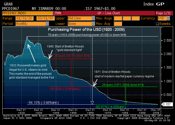
Most of the time, you cannot see the dilution of money as it happens, but you sure can tell the difference over a lifetime.
CWCID: Glenn Reynolds.
12 Comments:
By  MainStreet, at
Sat May 09, 12:18:00 AM:
MainStreet, at
Sat May 09, 12:18:00 AM:
This is a vivid illustration of how Obama intends to pay for his stimulus packages and redistribute the wealth. Fixed investments, pension funds, etc. will be decimated by inflation and the governments debt will be paid off in inflated dollars. I would think that when China and the Arab oil countries get wind of this, the foreign market for US treasuries will suddenly dry up. That is when the printing presses really get going and we risk hyper-inflation.
By  , at
Sat May 09, 12:39:00 AM:
, at
Sat May 09, 12:39:00 AM:
As a complete economic idiot I have one question,
How much gold you'd have to pay in 1933 for 62" flat screen HDTV?
By TigerHawk, at
Sat May 09, 06:15:00 AM:
Well, if your point is that the real purchasing power of the dollar is not necessarily correlated with our standard of living, I would agree. Better to think of it, in my opinion, as just another tax, in addition to all the other taxes. No one of them is going to destroy our standard of living. The question is whether together they burden our economy.
Of course, there are questions of justice involved in taxation as well. The inflation tax is not transparent, voted on regularly, or levied with any sort of discrimination. It simply hits pools of money, and -- obviously -- amounts to a transfer of wealth from creditors to debtors. The government, of course, is the largest debtor, but others benefit as well.
By cttaxed, at
Sat May 09, 08:01:00 AM:
Relative to what? What is the right hand Axis?
I can't steal and use this graph on my blog without better info.
(credit always given of course)
2.5 whats? A dollar equaled 2.5 whats?
Is this just a graph of inflation?
By , at
Sat May 09, 08:05:00 AM:
Judging from the always-cryptic Bloomberg ticker, the scale is purchasing power in 1967 (looking at the graph confirms), so 2.5 means 2.5 1967 dollars
By John, at
Sat May 09, 10:59:00 AM:
Interesting TigerHawk, in your analysis that the 'hidden tax' transfers wealth from creditors to debtors. I think this is characteristic of the pre-banking crisis of late, and is precisely why people could 'live large' so to speak, in America, while being in mountains of debt.
Also, notice the correlation between tumbling purchasing power/actual money value, and further centralized money planning/end of the 'sound' gold standard.
Can't be a healthy slope for any nation, whether you agree with centralized monetary planning or not.
By , at
Sat May 09, 10:11:00 PM:
This graph confuses me too. What is "purchasing power? in this instance; is it a basket of goods? Gold?
By Coach Morgan, at
Sun May 10, 12:40:00 AM:
Purchasing power is the inverse of inflation. When prices rise 3%, purchasing power falls 3%.
The chart is less startling than it seems. Over a 76 year period, 3.7% annual inflation will reduce purchasing power by 94%: 1/((1+.037)^76) = .063. Of course, there were several periods of high inflation in the graph, especially early in the time series and through WW2, so a lot of the damage to 1933 purchasing power was done in the first 14 years.
Also, note the peak of purchasing power was the sharp deflation at the beginning of the Depression.
Instead, take 1929 as the baseline and calculate 92.5% decline in purchasing power over 80 years (from 2.00 in 1929 to .157 today). That annualizes at 3.2% average inflation every year during the American century.
In the modern period of the graph, purchasing power fell 81% in the 28 years since 1971: that's an annual average inflation of 6%, but we know the highest rates were early in the time period, and prices have been much more stable, as the graph shows, since 1983.
Frankly, a short period of relatively high inflation, followed, probably, by another tough recession (like 1980-81), would help our national and personal balance sheets greatly. Bond holders will lose. Home owners and commodity producers will benefit.
By , at
Sun May 10, 11:24:00 AM:
Link:
We already have big spending imbalances in our government budgets ... Obama will make them worse. Inflation is a tempting way to devalue our current debt burden, but if we get in the habit of covering big continuing deficits by printing money ... that's the path to hyperinflation ... which for me is US inflation over 10%.
Much of the government debt we might try to devalue is actually off-balance sheet social spending commitments -- we can't devalue these commitments without political backlash ... there will be calls to index these benefits to inflation ... some of this is already baked in. It's ironic that companies like GM got into trouble by committing to retiree benefits when GAAP let them keep it off balance sheet and no one expected the costs of these benefits to increase as much as they have -- the US is making the same mistake, just on an even larger scale.
We can't expect to grow our way out of these problems. Economists are lowering longer-term expected growth rates to 2.5% instead of 3.5%. I expect it will be lower still for the next ten years. This would have huge consequences.
I'm a pessimist on growth rates. Our current environment makes it not a good time to be in business ... unless it's a connected business. Obama touts his "investments" ... but we know they won't work. It's as if we've taken all the poets in the freshman class and put them in charge of building bridges ... let's see what they come back with. Seen a venture capital- backed IPO lately .... Add it up, we'll see very little innovation ... and little true economic growth.
By , at
Sun May 10, 06:18:00 PM:
This graph is certainly counter intuitive. A person in 1929 owning a $1 million asset, like a home, would have been an unusually wealthy person in this country, unlike modern day New Jersey, but so what? If homes cost less of income to own I think that is certainly a very good thing. This graph seeks to say something negative about modern day monetary policy but it fails to make anything other than an arithmetic point. The value of the dollar has certainly depreciated but the items one can buy with those dollars is dramatically greater.
By Muddy Waters, at
Mon May 11, 06:02:00 PM:
Has anyone ever seen a graphing of the S&P or DJIA in constant dollars? I have not and am really curious to what it looks like.
I'd make one myself if I knew how. Are there any good free tools for this kind of thing?
TH, what did you use to produce this chart?
By , at
Tue May 12, 06:04:00 PM:
Laughable.
Misleadingly laughable.
Do you know, does anyone realize, what this graph really shows??
Something very simple. (let's leave aside the 1929-1939 bubble in the value of the dollar - deflation).
It shows only that inflation average 3.24% from 1929 to 2009.
Nothing more; nothing less. Nothing sinister, or economically odd about that. We had a period of high inflation (1973 to 1985) and a period of deflation (1929 to 1933 roughly), but pretty much have been on the modest inflation side for the last 80 years.
Modest inflation allows for more efficient adjustment of relative prices in a growing economy, because no change in the CPI leads to "sticky" prices, which has an adverse effect on economic activity (transactions).
This graph is exactly what we want to see. You should explain that to your readers
![]()