Thursday, October 21, 2010
The gender gap that hurts
Come November, almost no matter what happens we will read that men voted for Republicans in greater proportions than women, and that this represents some sort of problem for the Republicans that is, by the way, probably Sarah Palin's fault.
Or, perhaps, it will be a function of the increasing severity of the "Mancession":
Probably an artifact of the collapse of the construction industry, which men dominate, and the relatively security of "soft America" government jobs, which women hold in somewhat disproportionate numbers.
7 Comments:
By  , at
Fri Oct 22, 08:55:00 AM:
, at
Fri Oct 22, 08:55:00 AM:
Come November....
But it's a self-correcting problem, you see. As noted psychiatrist and family counselor Harry Reid has already stated, the ongoing mancession just means that we will be beating our wives all the more. Which, of course, will lead to our mass arrest, and the Democratic Party will be rid that troublesome second party and can set about their business without interfering checks and balances.
Eric Hines
By  Pyrus, at
Fri Oct 22, 10:46:00 AM:
Pyrus, at
Fri Oct 22, 10:46:00 AM:
Hard to know how much of the 37% gap it accounts for but there is the issue that firing an employee who is a woman carries a higher risk, all other things being equal, of leading to a wrongful termination lawsuit.
By Stack Trace, at
Fri Oct 22, 12:28:00 PM:
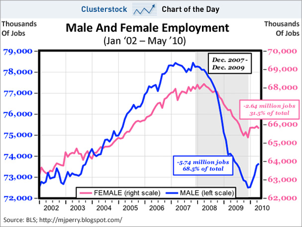
That's a misleading graph. Plotting two different series on the same graph, with different scales and baselines for each, and with the baselines far off-page, is a classic way to deceive. Whether the deception is intentional or not doesn't matter.
The actual data presented may be accurate, but the bogus scales and Y-axis offset were definitely chosen to create shock value.
You would be laughed out of the room in any decent science class for presenting such a bogus graph. It reminds me of the classic "Global Average Temperature vs. Number of Pirates" graph.
By , at
Fri Oct 22, 03:33:00 PM:
Reporter Catrina Hoff Summers wrote about "No Country for Burly Men" back in 2009. Her main point was that Pelosi purposefully skewed the mix of Stimulus spending away from men-friendly "shovel ready" infrastructure projects" toward "women friendly" state government spending. Her article had sourced quotes out of Nancy's own mouth. Meanwhile, Michael "AGW Hockey Stick" Mann got a $2.5mm grant from Stimulus ... that's literally true.
Great faux-NYT headline: "New York wiped out by Meteor ... Women and Minorities Disproportionately Affected!
I'm amazed by this on several levels, including by the lack of MSM reporting on it. The deeper story on how the sausage got made on The Greatest Pieces of Legislation of Our Lifetime has never been well reported. This continued on when Obamacare got adopted
But We're All in This Together, aren't we.
As I speak, while still a sitting President, Obama is running for office like no President has before. It's highly partisan -- Black, Public Union, Youth (hopefully), Women (hopefully) I'm a 53 year-old self-employed white male. Obama doesn't want my vote. Obama thinks I'm his cash cow. Ergo, he's not my President. This is what comes from Community Organizing.
My response -- Fuck all his supporting cohorts ... this won't NOT have consequences.
It comes to a head in 2011 when we're forced to deal with our being structurally broke as a nation. I didn't ask for this fight. But I won't be a wage slave to the BigGovBorg. Nor do I want my 15-year old daughter to be.
WE WON"T PAY THE BILL. Developing ...
By Cassandra, at
Fri Oct 22, 07:06:00 PM:
I'm sorry TH but Stack Trace is right -- that really is a horribly misleading chart.
Take a look at the right hand axis (the one that matches the female jobs).
The HIGHEST tick mark on the female part would position below the bottom of the male jobs axis.
If you visually take the entire pink curve and shift the whole thing so that the top of the pink curve is about an inch below the x axis of this chart, you might get somewhere closer to an honest portrayal of male vs. female job share.
By , at
Sat Oct 23, 12:50:00 PM:
I fail to see the misleading nature of the chart. It's clearly labeled on the axes, and key data points also are clearly labeled. It's a standard procedure to overlay two different curves, that have two different ranges, or even scales, on top of each other--hence the separate, clear axes labels and data point labels--in order to illustrate a point that their separate graphs would leave less clear.
Suggesting that this chart is misleading is to suggest that folks can't read and/or will look only the curves themselves. To the extent either is true, these are the problems of the reader. The presenter has done his job by presenting the data clearly labeled.
I won't dignify Stack Trace's cynical red herring of his alternative graph with any further response.
Eric Hines
By , at
Sun Oct 24, 11:11:00 AM:
"bogus scales and Y-axis offset were definitely chosen to create shock value"
Like E Hines, I don't see that at all.
Before the fall, men had over 78mm jobs. Now they're under 74mm jobs -- a net loss of about 4.4mm ... or a drop of about 5.6%.
Women were at 68.3mm, now at 66mm, a net loss of about 2.3mm a drop of about 3.3%.
The graph has higher numbers than mine as it's measuring peak to trough, and leaves out the "recovery" in 2010.
In absolute numbers, male job losses were about twice those of females -- but on a "base" that was about 15% larger.
Hope that helps.
***
By my rough math, I estimate that Stimulus paid for the salaries of nearly two million state and municipal workers for two years -- there's actually some basis for the "Jobs Saved" rhetoric.
But this was at the cost of "Jobs Lost" in the private sector. This is validated by the 3mm job difference between what Larry Summers expected for the unemployment rate and what we actually got.
![]()