Tuesday, August 18, 2009
Four "bad bears" and the ursine/bovine question
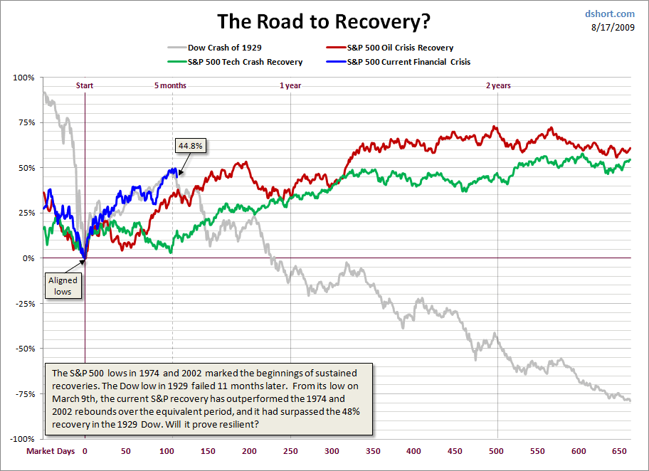
Of the following graph, Paul Kedrosky writes:
The chart compares recovery periods after major market implosions over the last hundred years. As you will immediately see, while they have many differences, flattening out, or even declining, is the most common pattern after the initial "we're not dead yet" bounce.

There's a difference between a rally in a bear market and an actual bull. This one still smells awfully ursine to me. But that's not a reason not to buy.
4 Comments:
By Robert Arvanitis, at Tue Aug 18, 09:29:00 AM:
Check the underlying fundamentals and drivers.
In the Roosevelt debacle, the natural recovery was crushed by New Deal efforts to "help."
Today, if recovery peters out, it will be because interest rates can only rise and tax rates can only rise.
By , at Tue Aug 18, 02:12:00 PM:
I agree with last post -- we have a lot of government-created headwinds that may mean that macro conditions actually worsen. Also, residential real estate is being propped up by the Fed through Fannie and Freddie -- this may work, but may not.
Link, over
By K. Pablo, at Tue Aug 18, 03:13:00 PM:
Articles of this type always strike me as arising from the "no team has ever come back from a 24-17 deficit in the Super Bowl" school of analysis. They are perhaps useful in predicting human behaviors (if market participants are influenced, for example) but the assumption that these curves are predictive of other underlying economic conditions seems specious.
By Georg Felis, at Tue Aug 18, 10:55:00 PM:
Well, yes. But this type of "harp and carp"ing goes on daily among both the tiny investor who might possibly have a comma in their portfolio, and those with two or more. As one of those single comma folks, I appreciate anything that might help keep me focused on the long-term instead of running around with the rest of the headless chickens (and all their lost commas).
Thanks TH.


